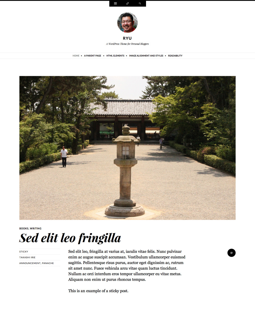
Thanks for waiting, Ryu is now available for self-hosted users!
Ryu theme is now available for download on Extend.
The story behind the design of the Ryu theme
I recently wrote a story behind the design of the Ryu theme on ThemeShaper. Check it out.
Behind the Design of The Ryu Theme
WordPress theme for personal bloggers — Ryu is now available on WordPress
The theme this blog uses, “Ryu” is now available on WordPress. Yes, you guessed right. It’s named after the main character of the classic game If you know why the character was named Ryu, you will understand why I named this theme Ryu too
I’ve created this free theme specifically for the Facebook, Tumblr, and Twitter generation of personal bloggers.
Demo site →
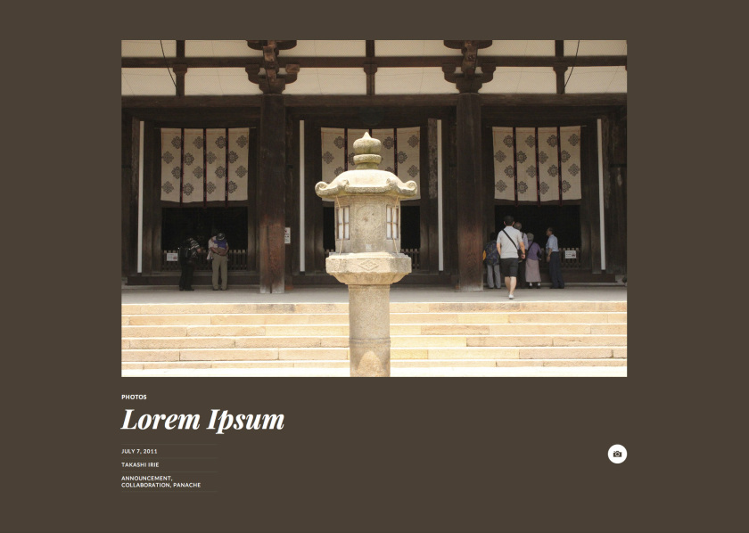
What I mean by “Facebook, Tumblr, and Twitter generation of personal bloggers” is bloggers who don’t necessarily spend long time writing long articles but often post more shorter ones or just images, videos, links, and so on. As you can see in this blog and the demo site, each post format has own style but the image format has a notable characteristic.
Do you remember the classic theme called Duotone? One of my teammates, Matías Ventura created Tonesque, a fantastic plugin inspired by Duotone. Tonesque lets us grab the average color of an image. Ryu uses it as an instrument to automatically change the background color of each post with image post format.
Other main features of the theme are the following:
- Post formats: Standard, Video, Image, Gallery, Aside, Link, and Quote.
- Wide width layout. The maximum width is 1272px wide so that you can show off your beautiful images in big size.
- Site owner’s Gravatar in the header. You’ve set your Gravatar, right?
- Grand typography.
- No sidebar. Yes, this is a feature. Let readers to concentrate on the content! For the generation of personal bloggers, the traditional sense of sidebar is often less important and we often just ignore whatever is in a sidebar anyway.
- Four optional widget areas in the top panel.
- Social link badges to your profiles on Twitter, Facebook, Pinterest, Google+, LinkedIn, Flickr, GitHub, Dribbble, Tumblr, YouTube, and Vimeo.
- No menu or a custom menu. A blog should have a menu only if it needs one. Ryu doesn’t display a menu as a default to keep it as simple as possible. Of course, if your blog needs a menu you can easily set up a Custom Menu.
- Support for flexible height Custom Header, a Custom Background.
- And of course it’s responsive. It looks and works great on smaller screens, such as the iPad and iPhone too.
Check out more info about Ryu on the theme showcase page and the announcement post on WordPress News.
Don’t worry, self-hosted users Ryu is
going to be also available on for you soon now available in Extend.
The story about behind the design of the Further theme
I recently wrote a story about behind the design of the Further theme on ThemeShaper. Check it out.
Behind the Design of The Further Theme
WordPress theme for professional publishers - Further is now available on WP
[UPDATE] Since this theme becomes Twenty Fourteen which released with WordPress 3.8, it’s no longer available to purchase for WordPress blogs.
Further - A theme I’ve been working on the past month has finally launched as a premium theme on WordPress. I’ve designed and built this theme in the way I would like a magazine theme for professional publishers be.
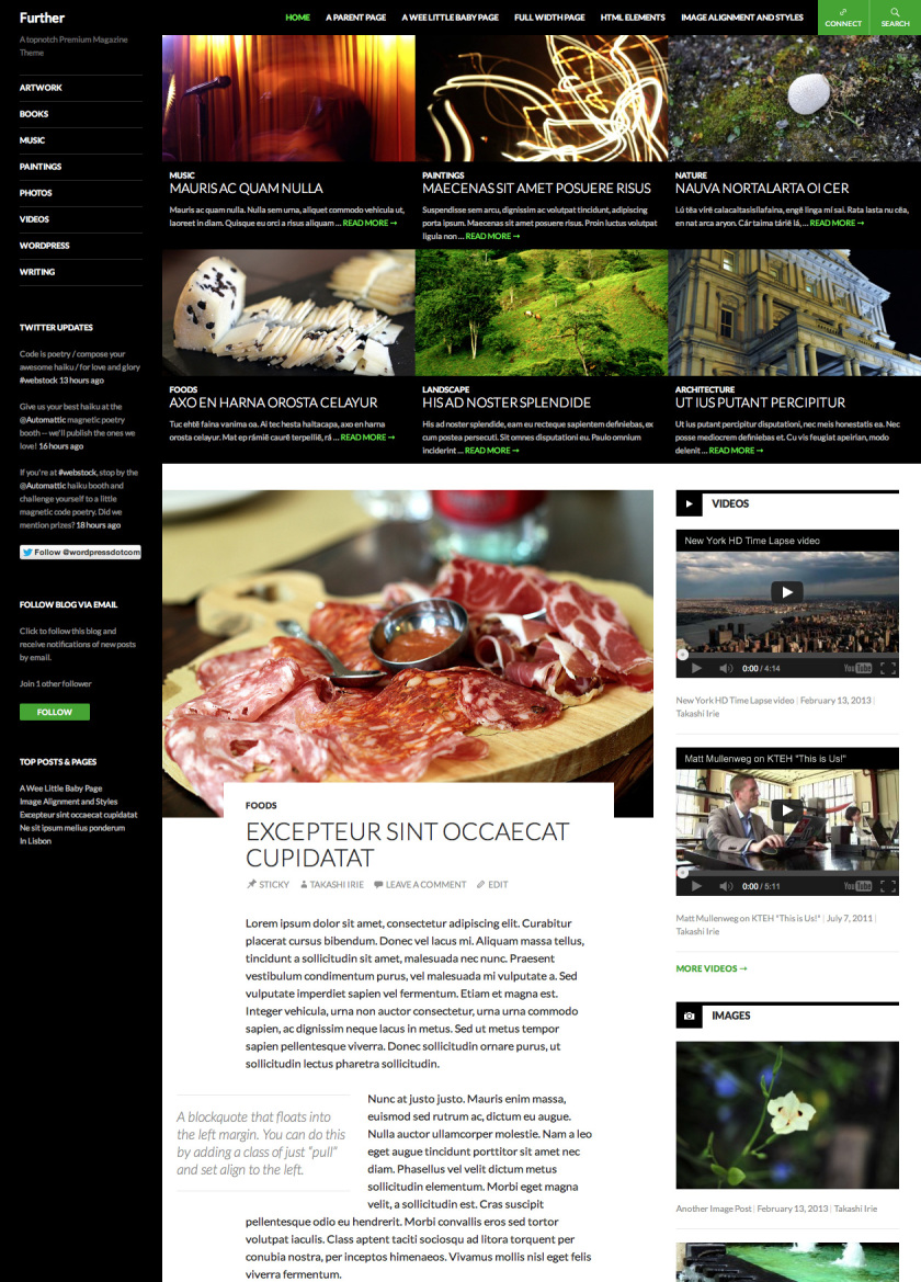
I devoted a great amount of attention to details on this theme and feedbacks have been incredible so far and I’m really grateful to hear them. I want to mention that I couldn’t build this without the help of my talented co-workers at Automattic.
The main features of the theme are the following:
- Of course, it’s responsive! It looks and works great on smaller screens, such as the iPad and iPhone too.
- Featured Contents at the top of the front page but not a typical slider with a huge image because I personally don’t like that kind of slider for a content heavy site. I want to skim through what’s been featured quickly.
- Elegant article style. The typeface I’ve chosen is Lato—one of my favorite typeface in Google Fonts. With a carefully chosen spacing, typography, column width and colors it maximizes the readers experience enhancing the content with a beautiful design.
- Post formats: Standard, Video, Image, Gallery, Aside, Link, and Quote.
- Post formatted posts feed on the front page: The theme displays the latest two posts from each format in the right sidebar.
- Links to your profiles on Twitter, Facebook, Pinterest, Google+, LinkedIn, Flickr, GitHub, Dribbble, YouTube, and Vimeo.
- Fixed Header: The header that contains a navigation, search, and social media buttons sticks at the very top of the page. Readers can access your menu at anytime without having to scroll.
- Seven widget areas.
- Supports for multiple locations of Custom Menu, flexible height Custom Header, a Custom Background
- Full-width Page Template.
Check out more info about Further on the theme showcase page and the announcement post on WordPress News.
Swissted
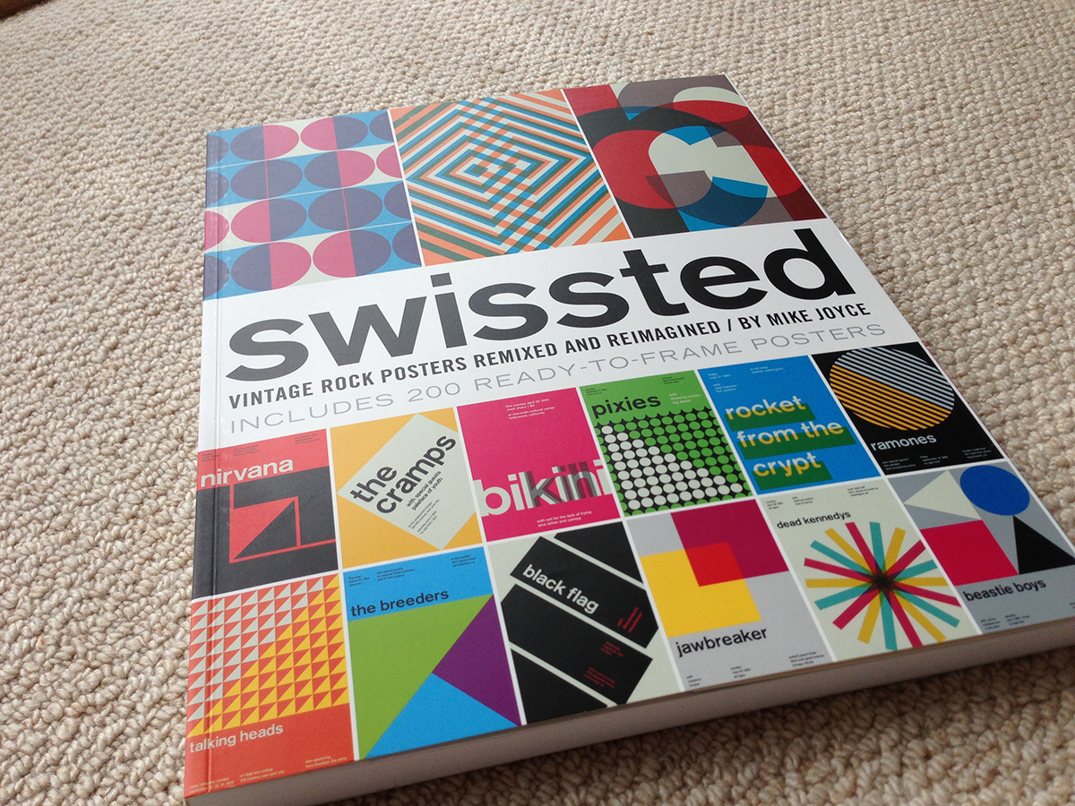
Yes, you guessed right. This is pretty cool stuff. It’s a set of modern recreations of classic rock posters in Swiss way. It’s bigger than an average book—11″x14″ and every page is microperforated and ready to frame and display.
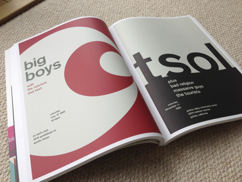
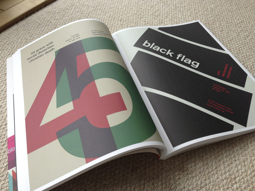
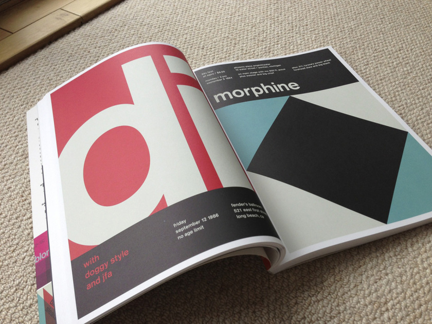
Swissted: Vintage Rock Posters Remixed and Reimagined →
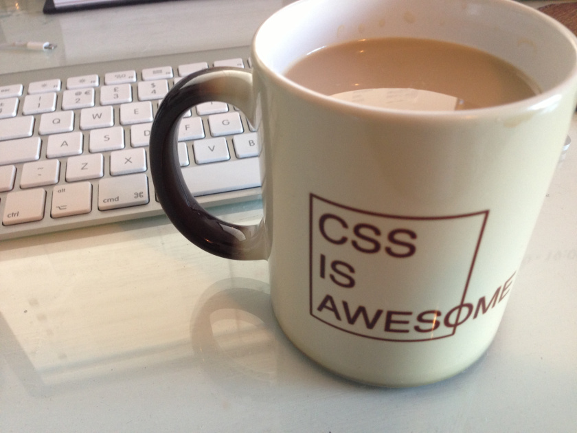
A mug from fellow Automatticians
The message appears when I have coffee or tea… whatever hot drink. How awesome is that!
Lingo Lounge Live Featuring Chuck Daniels
Derrick Carter 45 min Boiler Room Mix
… horrible crowd… but since we can see his play closely, it’s worth to post
