[UPDATE] Since this theme becomes Twenty Fourteen which released with WordPress 3.8, it’s no longer available to purchase for WordPress blogs.
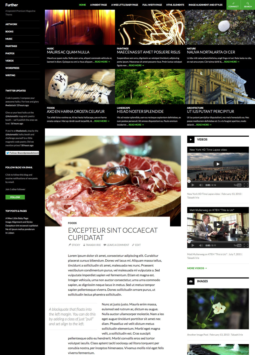
Further - A theme I’ve been working on the past month has finally launched as a premium theme on WordPress. I’ve designed and built this theme in the way I would like a magazine theme for professional publishers be.

I devoted a great amount of attention to details on this theme and feedbacks have been incredible so far and I’m really grateful to hear them. I want to mention that I couldn’t build this without the help of my talented co-workers at Automattic.
The main features of the theme are the following:
- Of course, it’s responsive! It looks and works great on smaller screens, such as the iPad and iPhone too.
- Featured Contents at the top of the front page but not a typical slider with a huge image because I personally don’t like that kind of slider for a content heavy site. I want to skim through what’s been featured quickly.
- Elegant article style. The typeface I’ve chosen is Lato—one of my favorite typeface in Google Fonts. With a carefully chosen spacing, typography, column width and colors it maximizes the readers experience enhancing the content with a beautiful design.
- Post formats: Standard, Video, Image, Gallery, Aside, Link, and Quote.
- Post formatted posts feed on the front page: The theme displays the latest two posts from each format in the right sidebar.
- Links to your profiles on Twitter, Facebook, Pinterest, Google+, LinkedIn, Flickr, GitHub, Dribbble, YouTube, and Vimeo.
- Fixed Header: The header that contains a navigation, search, and social media buttons sticks at the very top of the page. Readers can access your menu at anytime without having to scroll.
- Seven widget areas.
- Supports for multiple locations of Custom Menu, flexible height Custom Header, a Custom Background
- Full-width Page Template.
Check out more info about Further on the theme showcase page and the announcement post on WordPress News.
